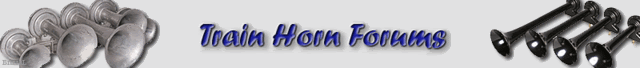
i made a banner in photoshop, what do u guys think?
i stuck with these colors because they fit the current forum colors and can be changed if needed.
i can make it without with fading horns but i felt it was a nice touch 
looks good to me! i like it
I like…
I like the fading horns. It gives a perspective of what’s available
I think that the text (Title) needs to be a whole lot more IN YOUR FACE
This is the face of the website… It should scream at you…
Actually, I think something like this would be even cooler…
Remember the old Memorex commercials with the guy in the recliner?
Instead of a stereo system, it could be a BIG ANIMATED TRAIN HORN!

that would be baller
A modernized variation on that theme would be to show the Marauder blowing at a group of young girls running off the street (like in the Terror on the Streets video), but their clothes being blown off…
![]()
Sounds like the guys at HB need to have an “outing”
Yes but its a MUST to scare people, otherwise were just collectors…lmao
This group, coming out together, would probably be pretty scary. 
nuf said…:eek:
oh the possibilities…muahahaha 
Banner looks good. Maybe and a catchy slogan.
Slogan:
“Ours Get Blown Daily”
![]()
I lke
How about “BLOW ME, I’M HORNY”
thats pretty good too
Just " BLOW ME"
Not bad, it’s straight and to the point!